What can you do with a screenful of teletext? Some answers are found in this look at design examples past and present. The deceptively simple teletext canvas accommodates an almost endless variety of art.
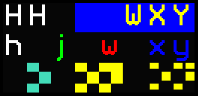 The graphics pixels in teletext are grouped into sets of six. Each mosaic of 'sixels' takes up one letter's worth of space. Sometimes the mosaics are displayed in a separated fashion.
There are invisible codes to change colour or separation that also take up a character cell each, often leaving a blank space in the design. These peculiarities may seem like frustrating limitations but they deliver amazing graphic designs to screens using just a tiny vocabulary of digital codes. Teletext was a true breakthrough at its conception and it remains a distinctive art style today.
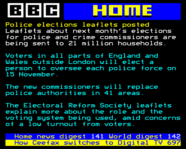
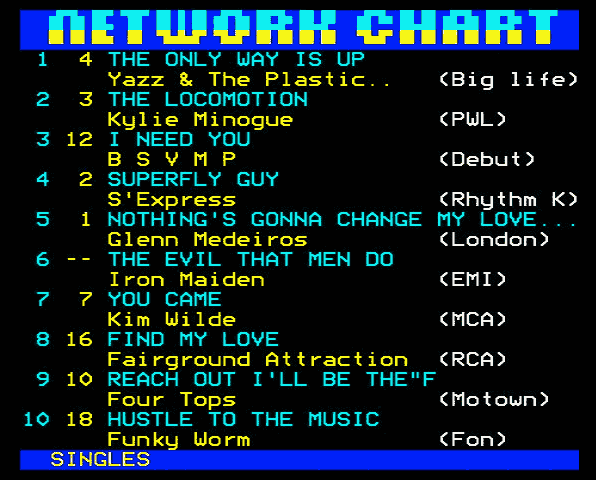
The most common teletext graphics form highly visible page headers above text content, particularly in news stories and list tables, as shown in the images above. The vast majority of teletext is variations on these two designs.
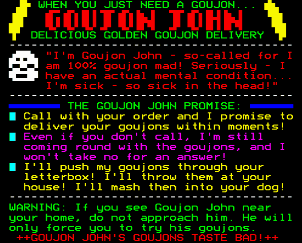
Occasionally teletext designs will include 'spot illos,' miniature illustrations amid the page's body text. Mr Biffo uses these often, as seen in one of his recent gag adverts below.
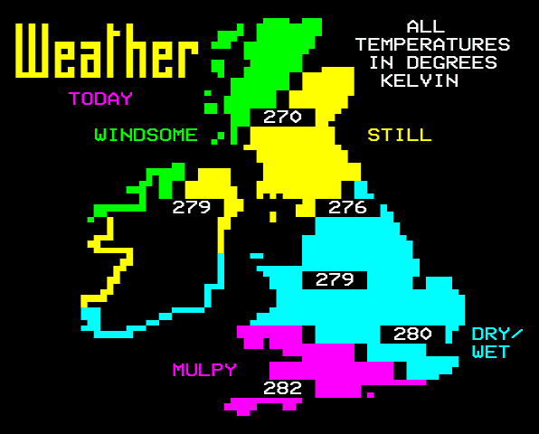
Then come larger elements like infographics, where text can become a minority element of the display. The classic example is a broadcaster's weather map, although the one above is a pisstake from The Day Today.
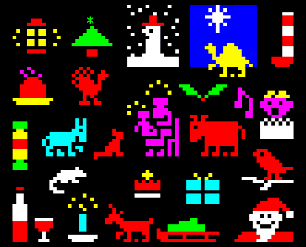
Devoting an entire screen to art was something even the earliest teletext designers did. The Christmas advent calendar below is from Ian Irving, who has produced teletext for Ceefax and Intelfax. It's primarily foreground graphics over black, with careful gaps here and there to allow for changes in colour. There are a few other tricks thrown in, for example short stripes of background colour:
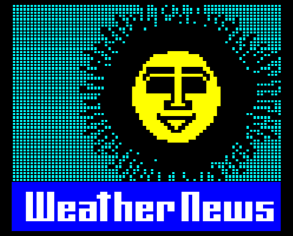
The 'Weather News' sun is a well-remembered design from Mort Smith of the Ceefax team. It's primarily separated graphics using 'negative space' – the space amid the coloured regions defines the artwork. Here too, black spaces make allowance for invisible codes permitting the mosaics to change from one colour to the next along each row.
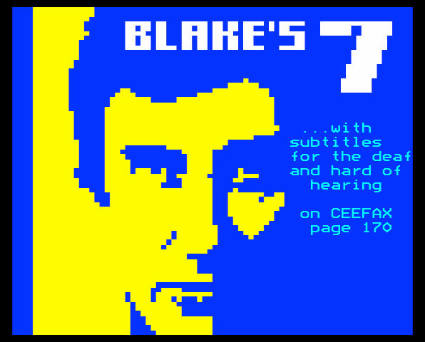
Because background colour always fills its cells, it's comparatively limited in its effect upon design. Below is a screen full of blue background rows that nevertheless complement the foreground in this advert for Ceefax subtitles:
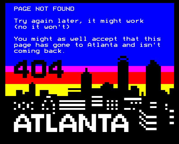
The error page above from the Teefax teletext service takes advantage of the striped nature of background colour. At points where the sky mingles with shapes, the illustration reverts to coloured mosaics over black.
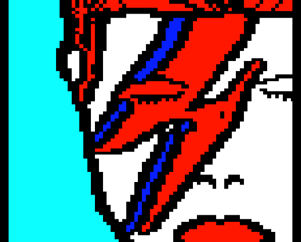
Steve Horsley often traces his colour changes tightly around the shapes he draws. These form the heavy, black 'code borders' that define the shapes in this David Bowie portrait he's done:
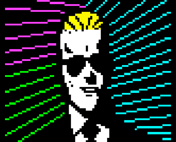
The artwork above right by Andy Jenkinson uses a similar trick, 'code shadows.' This sneaks codes into areas that the eye expects to be dark anyway.
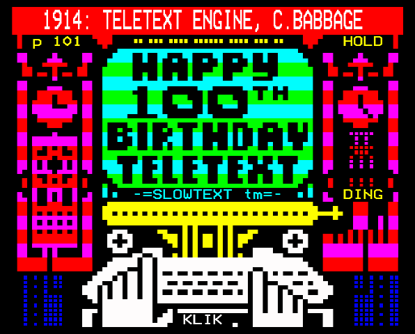
Below, Dan Farrimond has tightly wrapped colour around codes but in a different style. By alternating mosaic colour each row, he's created an illusion of background colour stripes.
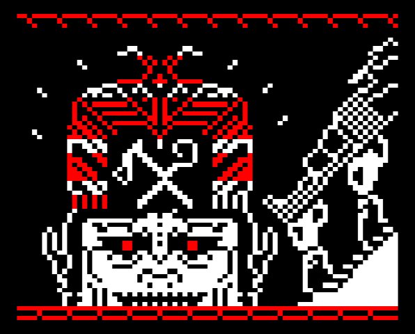
The next pic, above, is representative of the art book Thread of Fate by Raquel Meyers. For effect, the palette over black is limited to one or two colours and the image subjects are rendered in an angular style independent of the teletext pixels.
Jellica (Jake Manley) has only recently developed what he describes as 'a teletext problem.' His style is new and distinctive whilst incorporating classic techniques:
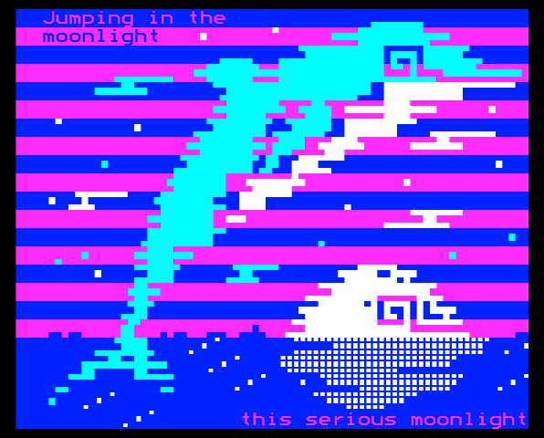
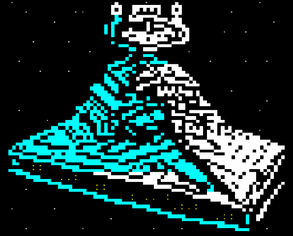
One last trick, above right, is another one from Horsenburger (Steve Horsley). For the tiny points of light he's used text mode full stops and colons amid the sixels.
The Artist's Canvas
Images of teletext are constantly shared online as teletextrs exchange pages past and present. Sometimes an editor link will be included for others to mashup or simply to show the artist's working. These links can be quite long so URL shorteners like goo.gl are recommended.
Here are some more tips for presenting teletext images on blogs and in social networks:
When you export an image from a teletext editor, it might look too narrow. Such raw content isn't really created to be looked at. Editors and televisions display that content a bit wider.
In typical examples of teletext, like those above, content is widened from 480x500 pixels to 576x500. Modern HDTVs may stretch the art further to 680x500. Those tellys do it to make room for a list of numbers at the bottom which is a handy subpage index. Below is a 480px-wide export graphic and a peek at the wide, indexed layout seen on some HDTVs:
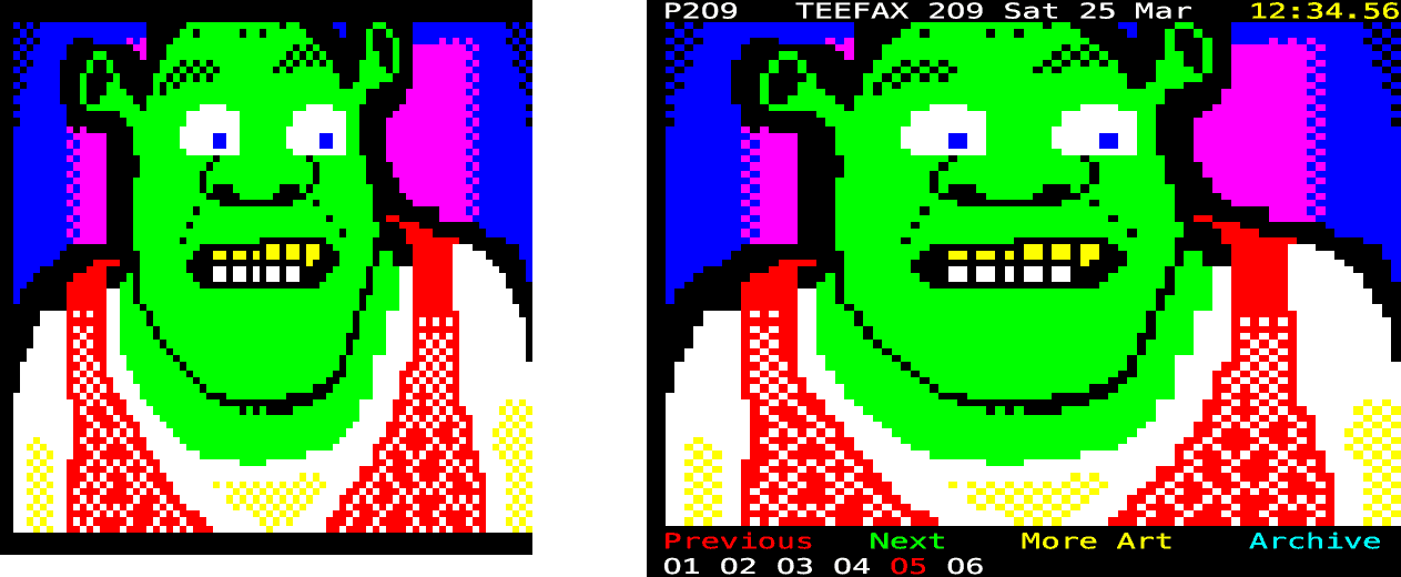
Forgetting the subpage index for a moment, note that the art above is only 23 rows high. Teletext services like ARDText and Teefax use rows 0 and 24 for things like the date and 'fastext links' which correspond to multi-coloured remote control buttons. Because teletext services are good showcases for art, 23 rows is a good maximum height to stick to.
Consequently, it may be practical to crop a bit off the top and bottom of your widened exports. If your art would look strange with its content sitting against the edges of the image, it may be worth leaving 10px or so of margins all round.
Sometimes, artists may simply choose not to adhere to these guidelines. For example, the last row can occasionally accommodate artwork if the teletext service agrees to forgo fastext for one page. In other cases it might be valuable for historians and others to preserve lines 0 and 24 of broadcast teletext. All 25 lines might also make sense for a screen shot in some documentation.
Art should, after all, be free as thought. If someone paints teletext onto the side of a building or a vehicle or even a cow, no one is going to fault the artist going narrower or wider to match their 'canvas.'
Inspired? Why not have a go yourself? Check out the How-To Guide PDF for Edit-TF, whose concepts also apply to ZX Editor, wxTED and other teletext editors.
I got my start in pixel art making graphics for VHS films on Commodore and Atari computers. Having later moved on to Adobe programs and such, I've recently been back in an 80's style doing teletext.
– Pete
Further reading: Teletext Lives, an introduction and Teletext Future, some thoughts on what's next.
Sources
Text is primary sourced. The jargon 'code borders' and 'code shadows' and assertions like 'the vast majority of teletext is variations on these two designs' originate from my own experience of teletext live and archived.
Jargon 'sixels' citation: Richard RT Russell, retrieved 18 April 2017. http://www.bbcbasic.co.uk/tccgen/manual/tcgen2.html#graphics
Jargon 'teletextr' by Carl Attrill. Teletextr Podcast, episode 1. Retrieved 18 April 2017. http://retrounlim.com/retrounlim/webfiles/audio/6994.mp3
Teletext character cells close up image. Own work. TrueType version of BBC ModeSeven font by Andrew Bulhak. http://dev.null.org/fonts
Police elections leaflets posted. BBC Ceefax, 22 October 2012. Own work replica from BBC Two, retrieved 18 April 2017. https://youtu.be/EEdF2K5BITI Full story on BBC News: http://www.bbc.co.uk/news/uk-20024361
Network charts. ORACLE S4C, 7 August 1988. Teletext recovery by Jason Robertson. Retrieved 18 April 2017. https://twitter.com/grim_fandango/status/822813869957586946
Goujon John by Mr Biffo. Paul Rose, Teefax. Retrieved 18 April 2017. http://teastop.plus.com:8080/?page=571
Weather map: simulated teletext art in the satire programme The Day Today. Fair use own work replica with corrections to make it legal teletext. Reference for the term 'mulpy' here: http://www.urbandictionary.com/define.php?term=mulpy
Ceefax advent calendar by Ian Irving. Own work replica from image retrieved 1 December 2016. https://twitter.com/russty_russ/status/547652502116896768
Weather sun by Mort Smith, BBC Ceefax, 22 October 2012. Own work replica from BBC Two, Retrieved 18 April 2017. https://youtu.be/EEdF2K5BITI Mr Smith confirmed his authorship to me at the Teletext Block Party, 25 March 2017. https://flic.kr/p/RbYoN5 The weather sun in Nite-Owl: https://youtu.be/ple1Dzwa6tk Mort Smith on his Nite-Owl work: https://facebook.com/groups/TeletextGroup/permalink/1177482592346090
Blake's 7 subtitles, Ceefax 5 October 1981. Own work replica from still image retrieved 3 October 2016. https://twitter.com/scorpioattackb7/status/783047977564790784
Teefax error page. 'Atlanta' text logo and page copy written by Peter Kwan. City skyline and background colours are own work. Retrieved 18 April 2017. http://teastop.plus.com:8080/?page=404
David Bowie portrait by Steve Horsley. Retrieved 18 April 2017. https://www.horsenburger.com
Max Headroom portrait by Andy Jenkinson. Retrieved 18 April 2017. https://twitter.com/andyuglifruit/status/784543301621907456
The Teletext Engine by Dan Farrimond. Retrieved 18 April 2017. http://teastop.plus.com:8080/?page=510
Jake Manley quotation, retrieved 18 April 2017: https://twitter.com/JellicaJake/status/850647572863746048
This Serious Moonlight by Jake Manley. Retrieved 18 April 2017. https://twitter.com/JellicaJake/status/853666385792290816
Star Destroyer spacecraft from Star Wars by Steve Horsley. Retrieved 18 April 2017. https://www.horsenburger.com
500px teletext height is 25 times the 20px specified in the last published European Telecommunications Standard. Retrieved 18 April 2017. http://www.etsi.org/deliver/etsi_i_ets/300700_300799/300706/01_60/ets_300706e01p.pdf
576px teletext width is own research in collaboration with Alistair Cree, Peter Kwan and Simon Rawles, based on the Signetics SAA5050 teletext decoder chip. Datasheet retrieved 18 April 2017. https://amigan.yatho.com/saa5050.pdf
HDTV width of 680px is own work, calculated from aluminium tape measurements of live teletext on a Samsung D5520 high definition television.
Level 2 features are not covered here as tools to create them are not yet democratised. The presence of side panels, for example, would increase all width measurements above.
Shrek portrait by Simon Rawles. Retrieved 18 April 2017. http://teastop.plus.com:8080/?page=209
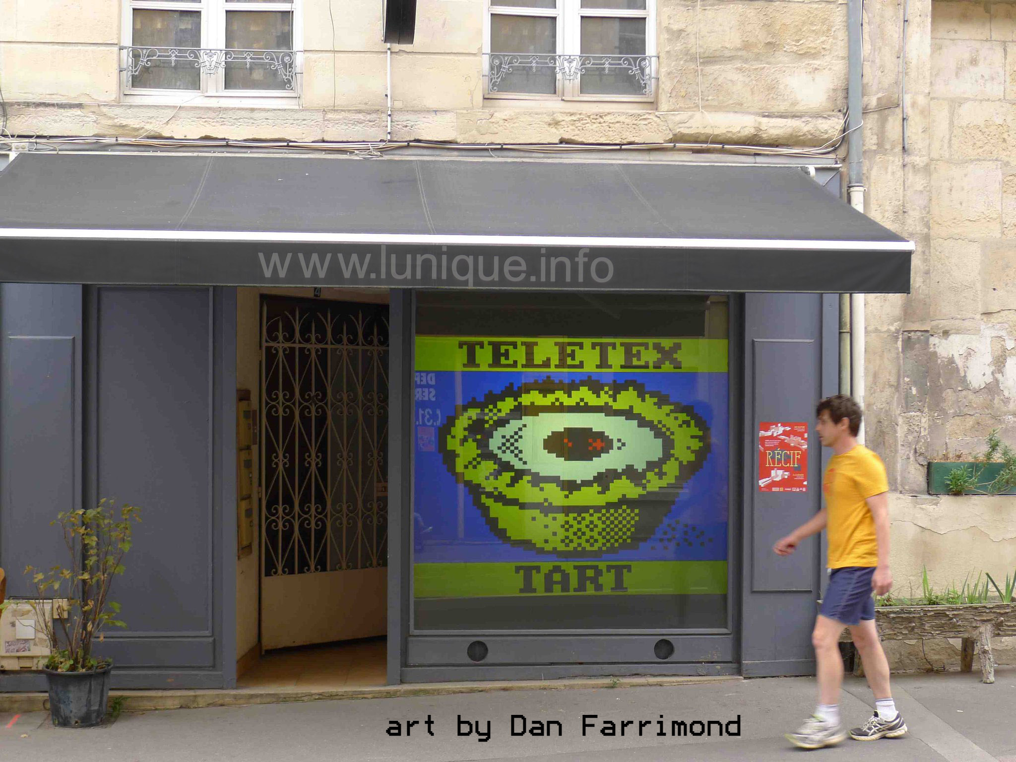
Teletex Tart by Dan Farrimond. Photograph of the l'Unique gallery in Caen, France retrieved 27 October 2016. https://twitter.com/illarterate/status/791740106793156609
Header image not used in body text: The Money by Felix Vallotton, interpreted as teletext by Carl Attrill. Own work replica from image retrieved 18 April 2017. https://twitter.com/that_other_Carl/status/842306179858612224
